
-
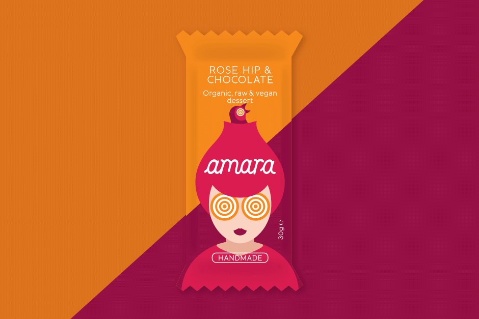
Packaging & logo design | amara
Craving authenticity? We designed the appetizing logotype, captivating illustrations, and vibrant print packaging that brought this organic raw bar range from concept to shelf, establishing its irresistible, natural appeal.
-
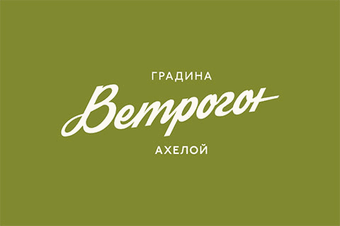
Logotype & packaging | Vetrogon
From the ground up, we established a distinctive identity for this Bulgarian start-up, delivering naming consultancy, logo design, cohesive packaging and printed means, to capture the purity of their bio Goji berry brand.
-
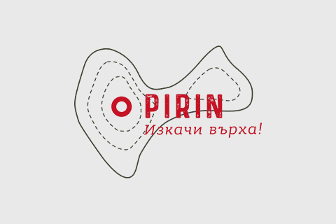
Logo, web & packaging design | Pirin
Graphic and web design agency Zen Studio made a logo, website and packaging design for energy bars and crackers
-
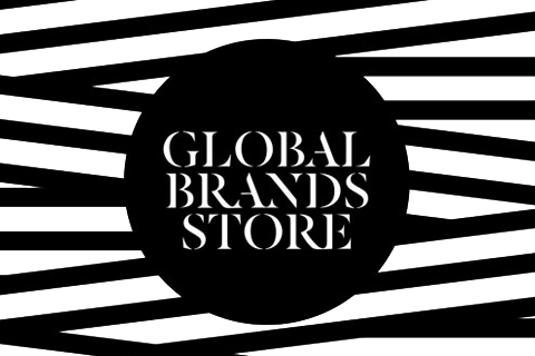
Packaging and vouchers design | Global Brands
Design of packaging and communication materials for the fashion retailer Global Brands
-
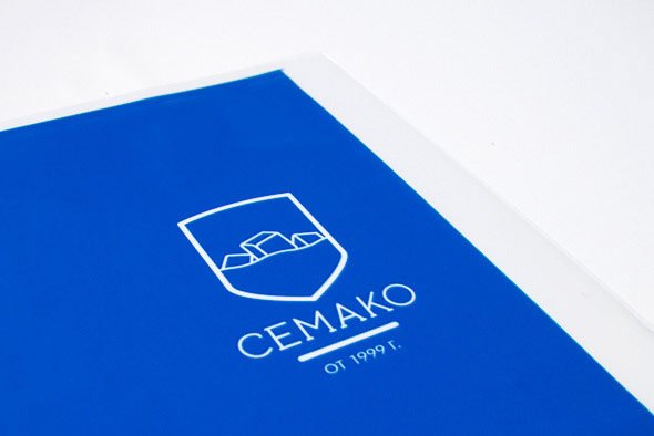
Logo and packaging re-design | Cemako
Cemako asked as to redesign their brand identity. We developed a contemporary family crest inspired logo and applied the new identity on their ice packaging and delivery vehicles.