Logo rebranding proposal for a wine producer
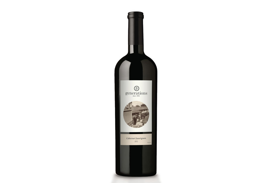
A wine producer approached us for the redesign of logo and labels for his family run business. The brand name under which the wine is being sold - 7 Generations - indicates already the long tradition this family has in winemaking.
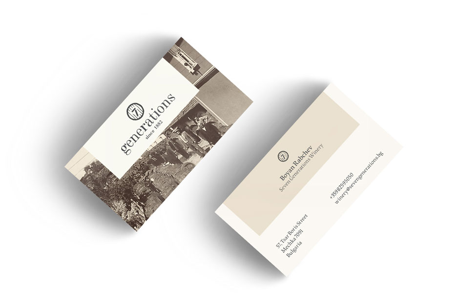
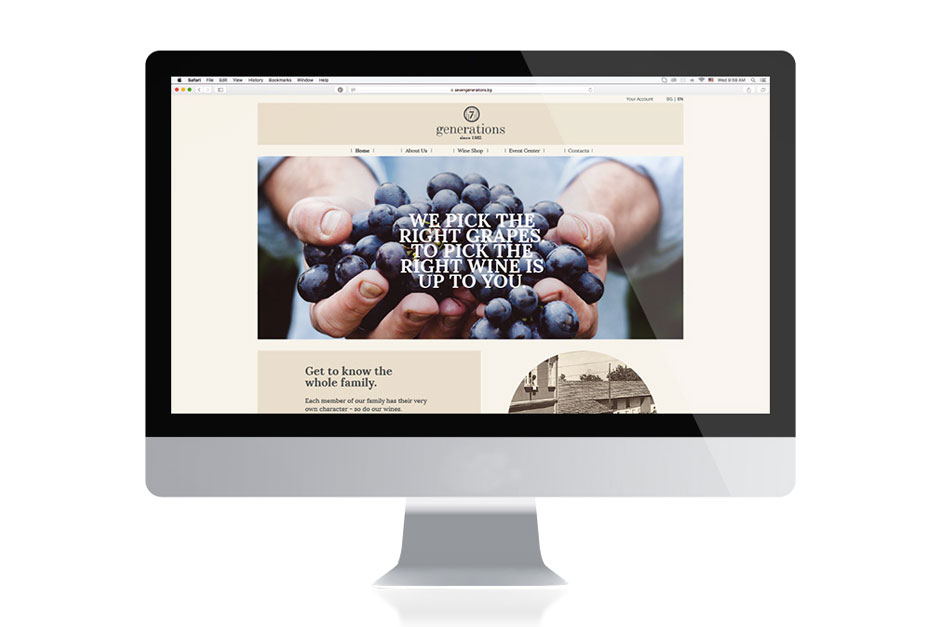
Our visual approach of the logo sign proposal refers to the way wooden barrels in which the wine is left to mature are being marked. Due to the wood cut effect, the chosen logo typography emits a feeling of artisanal manual labor, but being elegant at the same time. The colours chosen for the winemaker's stationery and website are soft tones of beige and apricot that remind of old paper and pictures and thus convey a feeling of old times nostalgia.


