
-
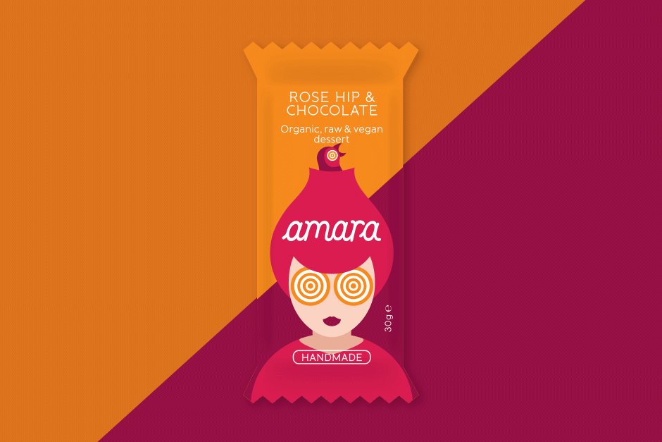
Packaging & logo design | amara
Craving authenticity? We designed the appetizing logotype, captivating illustrations, and vibrant print packaging that brought this organic raw bar range from concept to shelf, establishing its irresistible, natural appeal.
-

Logo and catalog graphic design | Fora
We built the foundation for the Fora brand, providing expert naming and a contemporary logo design, then crafted a complete visual brand identity and high-quality catalog to position their modern wooden doors as the definitive choice in sophisticated interiors.