
-
Logo and web design | Smart Electrix
Zen Studio created a logo and modern corporate website for the photovoltaic systems and energy efficiency company Smart Electrix.
-
Web & Logo Design | Nat Food
Video, product photography, logo design, website development for Nat Food – natural foods and desserts.
-
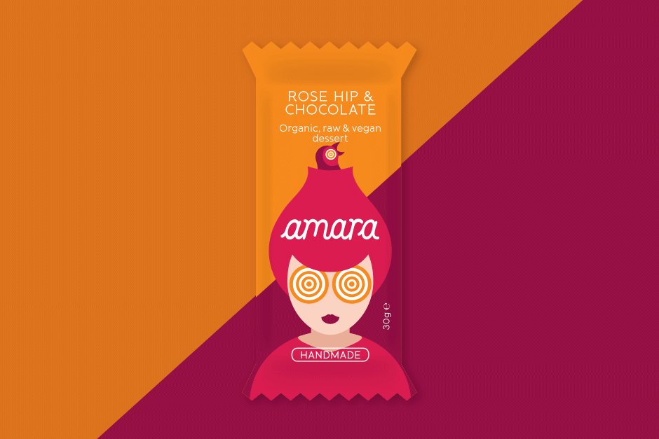
Packaging & logo design | amara
Craving authenticity? We designed the appetizing logotype, captivating illustrations, and vibrant print packaging that brought this organic raw bar range from concept to shelf, establishing its irresistible, natural appeal.
-
Logo, website & catalog design | Lightdox
Zen Studio designed a brand identity, website and catalogue for a film distribution company
-
Logodesign, webdesign and SEO | MG Pro
Zen Studio designed a professional logo and SEO website for the industrial automation engineering firm MG Pro
-
Logo and web design | Qubiqo
Corporate brand identity, website and printed communication tools design for an engineering company in water applications
-
Logo and identity redesign | Enigma
Zen Studio redesigned the logotype and the brand visual identity of Enigma Leather fashion boutique.
-
Logotype & packaging | Vetrogon
From the ground up, we established a distinctive identity for this Bulgarian start-up, delivering naming consultancy, logo design, cohesive packaging and printed means, to capture the purity of their bio Goji berry brand.
-
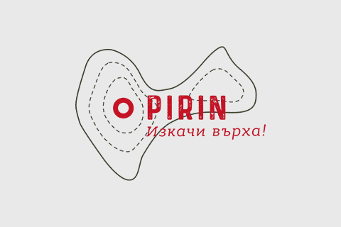
Logo, web & packaging design | Pirin
Graphic and web design agency Zen Studio made a logo, website and packaging design for energy bars and crackers
-

Logo and catalog graphic design | Fora
We built the foundation for the Fora brand, providing expert naming and a contemporary logo design, then crafted a complete visual brand identity and high-quality catalog to position their modern wooden doors as the definitive choice in sophisticated interiors.
-
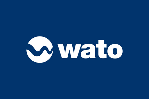
Logo, web & print design for a start-up | WATO
Starting from a blank page, Zen Studio provided the naming, logotype, website design, and visual assets for this start-up – to launch the brand from obscurity to undeniable notoriety.
-

Dynamic brand identity
Inspired by custom-made travel experiences, we designed a dynamic identity system for Anywhere & Rado. Moving beyond static logos, this flexible visual matrix adapts and changes based on the travel destination and direction, delivering a truly customized brand experience.
-
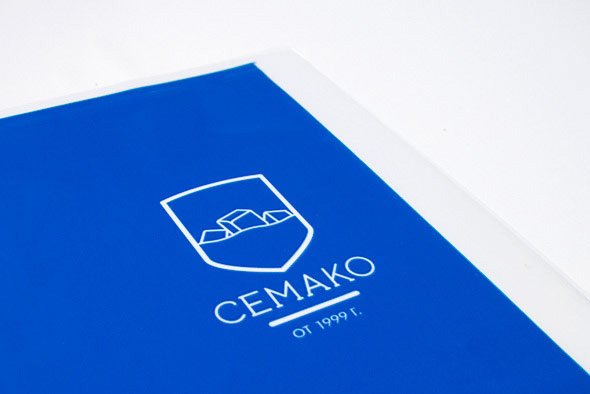
Logo and packaging re-design | Cemako
Cemako asked as to redesign their brand identity. We developed a contemporary family crest inspired logo and applied the new identity on their ice packaging and delivery vehicles.
-
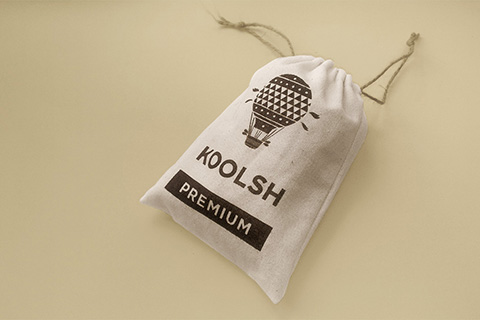
Full identity and communication pack | Koolsh
Naming, logo and on-line store design, communication tools, point of sales branding …
-
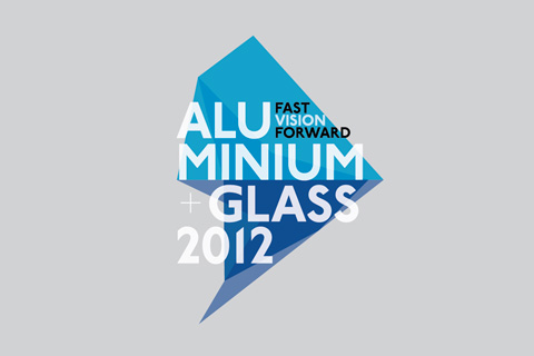
Visual concept for an event Aluminium + Glass
Aluminium+Glass event – visual concept for an event for architects and engineers
-
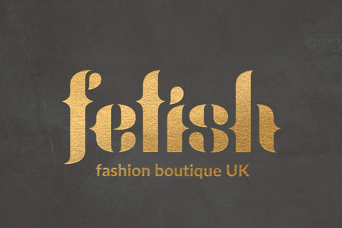
Brand identity | Fetish
Logo design, web design and branding for Fetish – an online fashion store
-

Logo, identity, web design | Sanuk
Logo and web design for innovative start-up company in the financial and loan services
-
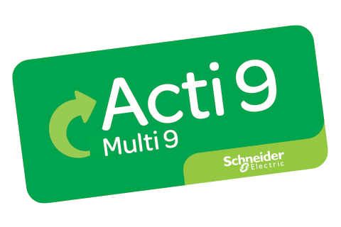
Visual signage design | Acti9 launch
Zen Studio designed a substitution sign for Schneider Electric’s core product range Acti9.
-

-

Logo & web design | Accinor
Logo design with personal typography and website development for Accinor – accounting firm in France
-

Identity and communication design for festival event
Visual identity for festivity event in France Les 4 jours de l’Aigle
-

Logo and web chart design | Chitalishteto
Logotype design for a web portal for cultural events Web design